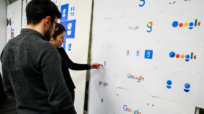
Search king Google has unveiled a new logo which has seen the smoothening of text in to a new image. The company says that the new logo can be easily read on the small screens. Google has emitted the curly serifs from the letters and have replaced them with a smoother look.
Google has said that the new logo reflects the reality of what the company actually is today. Search engine giant made an official announcement on its blog and wrote, “As you’ll see, we’ve taken the Google logo and branding, which were originally built for a single desktop browser page, and updated them for a world of seamless computing across an endless number of devices and different kinds of inputs (such as tap, type and talk)”.
At the same time, the new arrangement of the logo is not related to the re-organisation. This is a major change that has been announced by Google in recent times. The statement by Google has not made any reference to the change but has mentioned about the importance of shrinking the text so that it can be read in all kinds of screens.
More changes will be made in the branding of the search engine to match with the new logo.
Photo Credits: Tech Crunch


